Shadow
Shadow creates the perception of depth and distance between layers, establishing a visual hierarchy that enhances comprehension and adds realism to distinguish between different content layers.
Salt provides a ramp consisting of five levels of shadow, ranging from shadow-100 to shadow-500. Each level has specific horizontal and vertical offsets that change as the shadows grow, providing a graduated effect between soft and strong shadows.
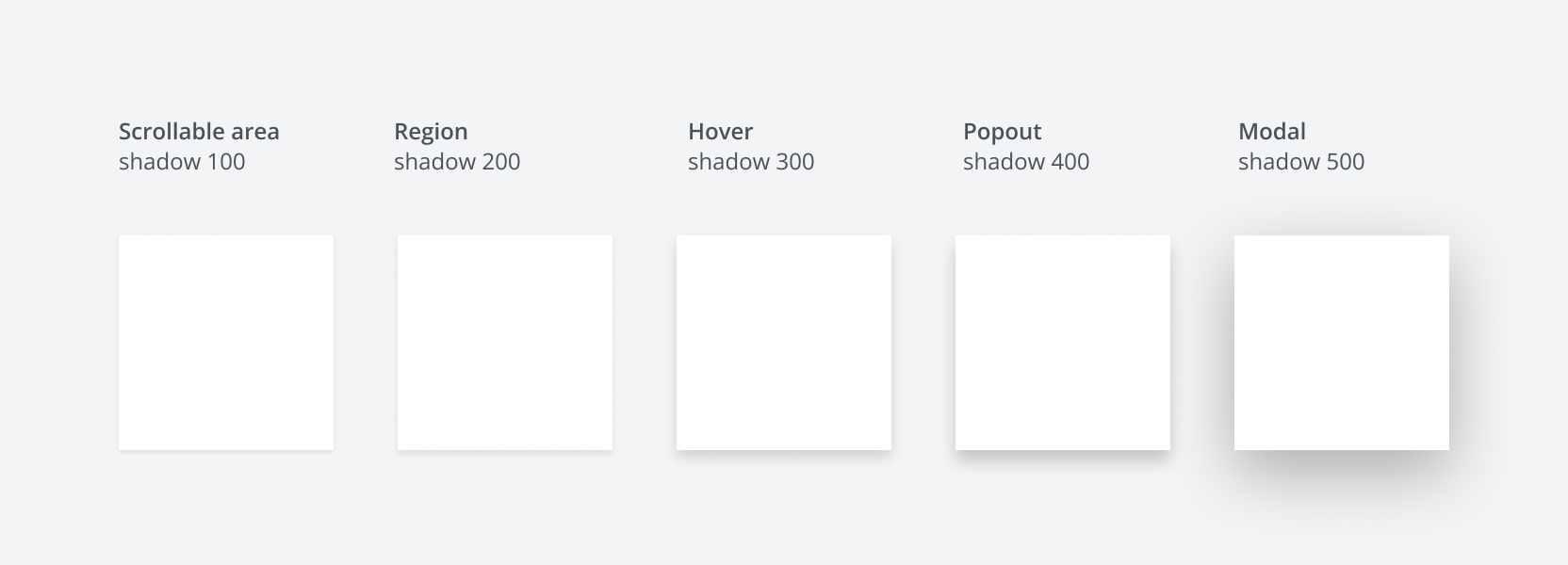
There are six shadow levels to choose from.
| Token | X-Axis (px) | Y-Axis (px) | Blur (px) |
|---|---|---|---|
--salt-shadow-100 | 0 | 1 | 3 |
--salt-shadow-200 | 0 | 2 | 4 |
--salt-shadow-300 | 0 | 4 | 8 |
--salt-shadow-400 | 0 | 6 | 10 |
--salt-shadow-500 | 0 | 12 | 40 |
Shadow-100 is the closest to the surface and is used exclusively for scrollable areas where the content exceeds the visible screen space, allowing users to scroll up or down. This is typically positioned at the top of an overflowing area, providing a subtle hint of depth without casting a noticeable shadow.
Shadow-200 introduces a slight elevation, offering a soft shadow that begins to separate elements from the background. This level is suitable for components that require a gentle lift, such as cards or small panels.
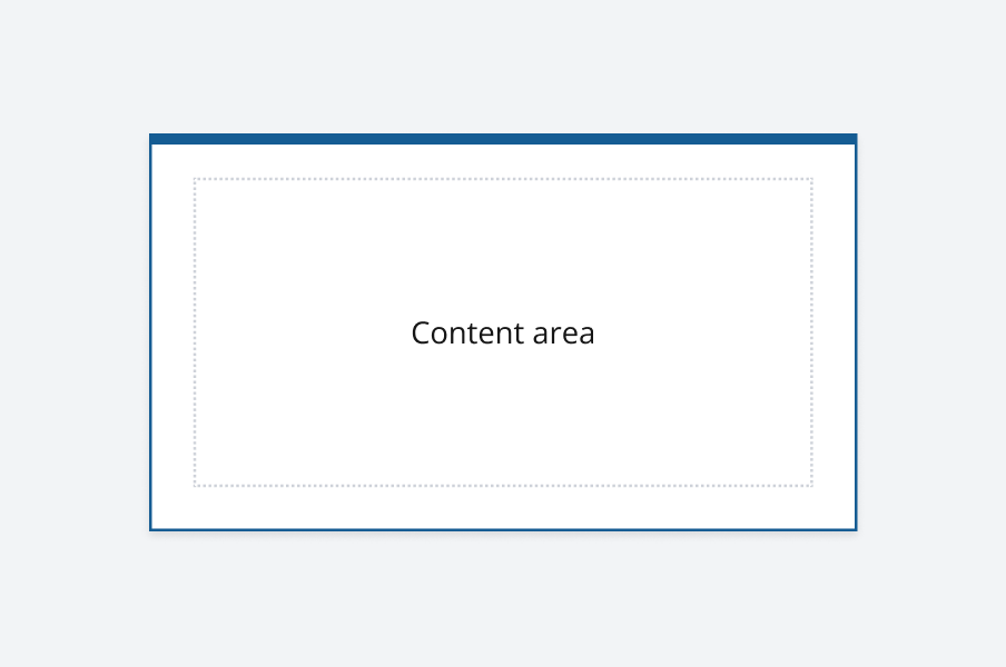
Shadow-300 provides a moderate level of separation with a more pronounced shadow. It is ideal for elements that need to stand out more distinctly, such as dropdown menus or tooltips.
Shadow-400 offers a strong contrast with well-defined edges, making it perfect for components that require significant emphasis such as a popout. A popout is a window above the interface with a shadow that temporarily overlays elements, e.g. Toast, Tooltip, Overlay.
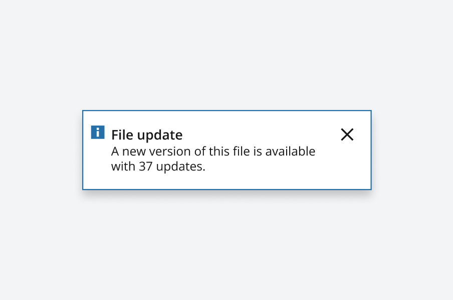
Shadow-500 is the furthest away from the surface and is reserved for modal dialogs only. It creates a dramatic effect with a strong shadow, ensuring that modal dialogs are clearly distinguished from the rest of the content. For a modal, the user must interact with the overlay window, which typically has a scrim behind it, before interacting with the page content.
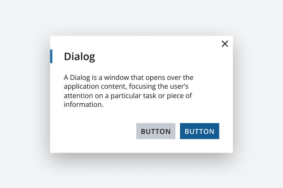
A scrim is a complimentary darkened or lightened surface that obscures the background by making the underlying content appear subdued. Scrims can be full screen or only occupy a region, allowing for a greater modal elevation.

We appreciate your thoughts and feedback on any content in the Salt foundations. Please contact us if you have any comments or questions.